Web Font Anti-Pattern: Overusing web fonts
October 13, 2015
This is my favourite web font anti-pattern and one I often get wrong myself; why are you using web fonts for that? I get it. Web fonts are great. I love them too, but they are overused.
The global average of font requests per page has tripled in the last couple years. It’s great that developers and designers are using more web fonts, but there is a tendency to use more web fonts than is reasonable. It is now common to see sites loading dozens of web fonts.
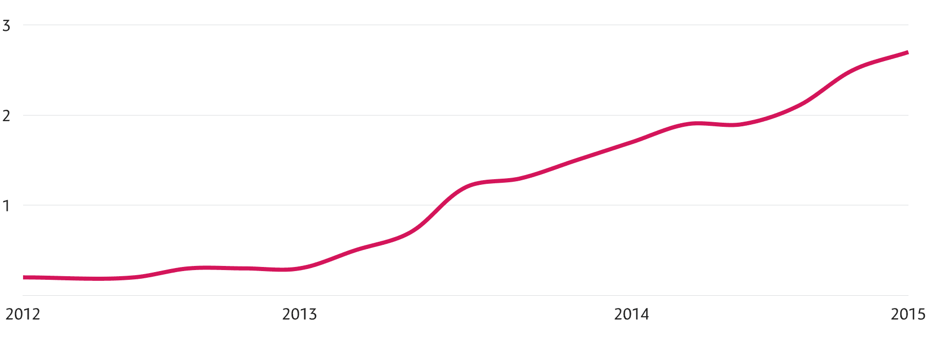
The average number of font requests per page has increased steadily over the past couple of years. From almost none in 2012 to roughly three fonts per page in 2015. (Source: HTTPArchive)
Every additional font comes at a cost. It’ll increase your page load times and if you’re relying on the browser’s default behaviour it’ll also block your site from rendering until the fonts have loaded. This is largely the reason for the recent backlash at web fonts. However, it is not necessary to use content blockers for web fonts if they are used with consideration and moderation.
It’s perfectly fine to use web fonts for headlines and body text. Ideally a web site should only use 3-6 fonts per page. More than that should be reserved for exceptional cases (such as type specimen pages and design web applications). Examine your typographic hierarchy and consider using existing fonts before adding a new font.
Using web fonts for lettering
Another recent trend is using web fonts where they’re not appropriate. Don’t use web fonts if you don’t need them. They’re not the right answer for everything. If you find yourself wrapping each letter or word in a span element in order to style them — stop. Use SVG.
Most of the times when you’re wrapping words and characters in span elements you are actually attempting to do lettering in HTML and CSS. There is a fine line between type and lettering, and web browsers are not great at the latter. SVG on the other hand is a great fit for lettering. It’ll give you absolute control over kerning, tracking, position, gradients, masking, and colour. As an added bonus, the resulting SVG file size will be smaller than loading several fonts.

Do you really need to use web fonts for a headline like this? Maybe SVG is a better choice.
Using web fonts for lettering becomes especially problematic in responsive design. If you use web fonts you’ll need to adjust the position and size of each span at each breakpoint. This quickly becomes tedious. If you’re using SVG you can easily scale and switch between SVG files for different breakpoints.
Another issue with using web fonts for lettering is localisation. If you use web fonts for lettering you’ll need to aggressively subset your fonts to make them small enough so that they load quickly. By doing that you’ll also make it difficult to translate your lettering in other languages, which often uses different character set.

Overusing web fonts and aggressive subsetting is not a good combination. The characters i, m, and W are not in the original subset, but are required for a German translation. You’ll need to expand the subset for these characters, further inflating the font file size.
Finally, consider what happens when your web fonts fail to load. Most typefaces used for lettering have no good fall back options. Most “web safe” fonts do not contain OpenType features like swashes and discretionary ligatures that are often used for lettering. Not many of the web safe fonts are scripts, so at best your fonts will fall back to a completely unrelated script font. In the worst case it will fallback to a default serif or sans-serif, because some platforms (like Android) only come with a sans-serif, serif, and monospace typeface.
Web fonts (and typefaces) are meant for body text and headlines. Text that can be selected, copied, and re-used. Lettering is usually a one-off thing for logos, illustrations, and art. It’s perfectly fine to do lettering in SVG. If you’re worried about accessibility (you should be!) SVG has several good ways to increase accessibility.
This article is part one of an ongoing series on web font anti-patterns. Read the introduction, part 1, part 2, part 3, and part 4.